Mon, 2nd Jan, 2017
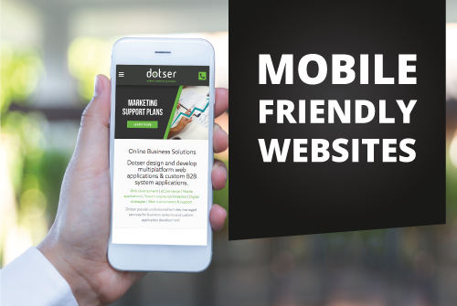
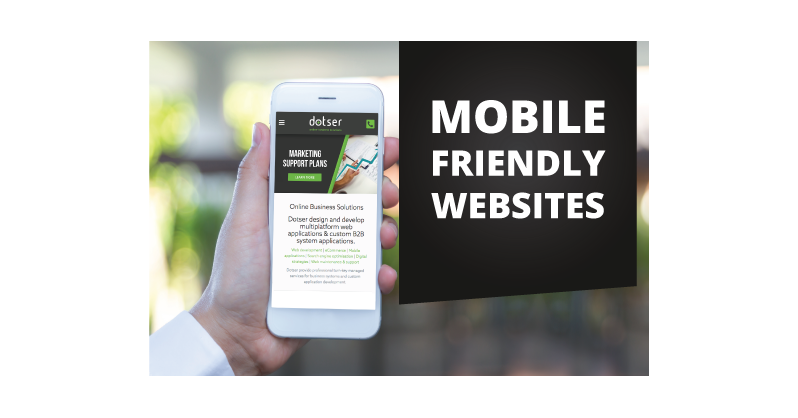
Responsive - View on any device
Join the movement to mobile friendly web sites with Dotser responsive mobile solutions.
The most recent release of the Dotser platform brings with it the most comprehensive mobile website solution for business, optimising your website user experience for mobile and desktop users.
Following extensive user research and navigation patterns, the mobile responsive Dotser platform has streamlined navigation on smartphones and tablet devices, making it easier than ever to scroll and search information on your website.
As the market is clearly moving to mobile devices as the main user tool for viewing the internet, your business must prioritise making their experience as user friendly as possible.
Contact Dotser today and bring your website to where it needs to be to compete in the mobile marketplace.
